Branding
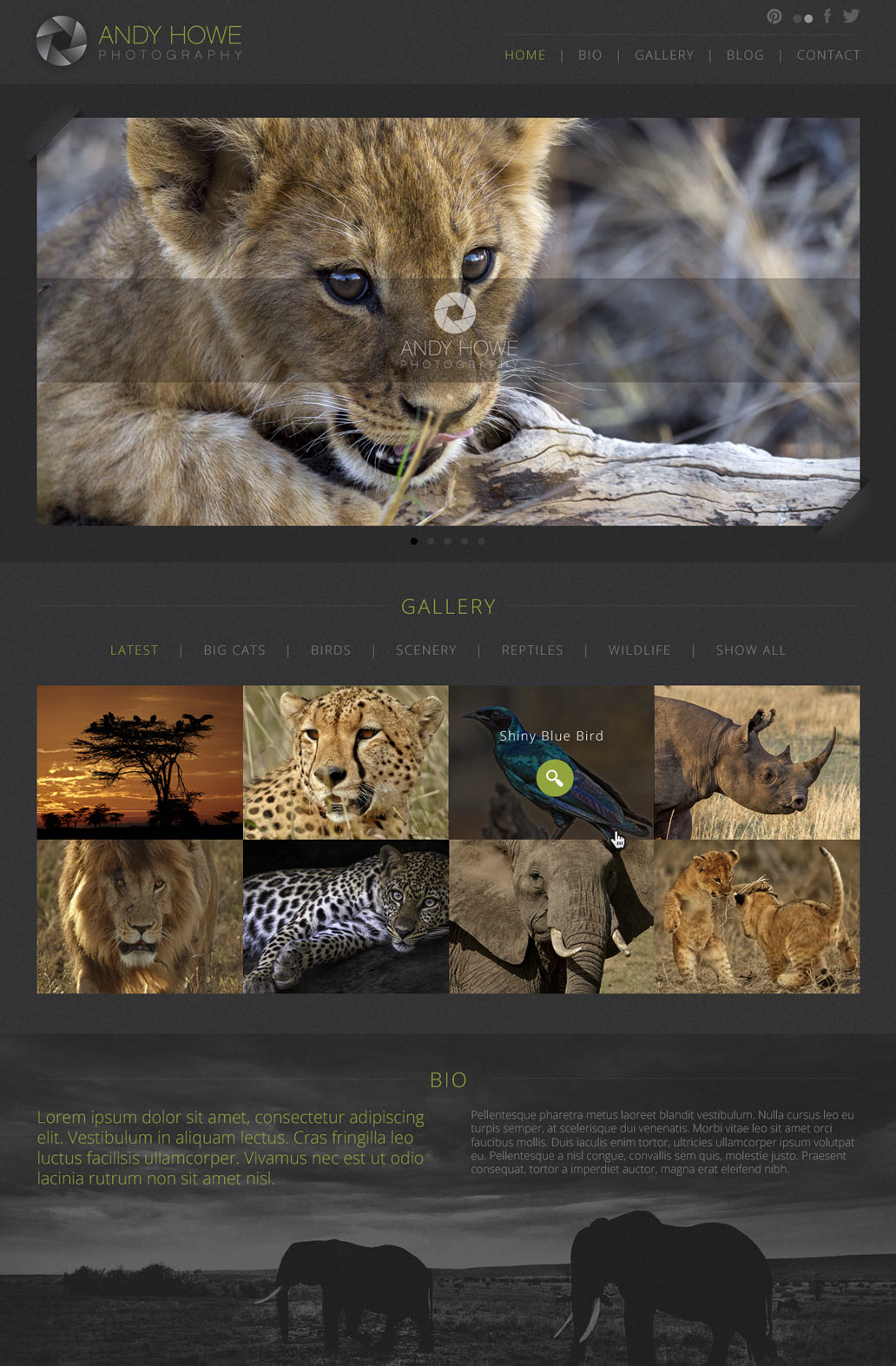
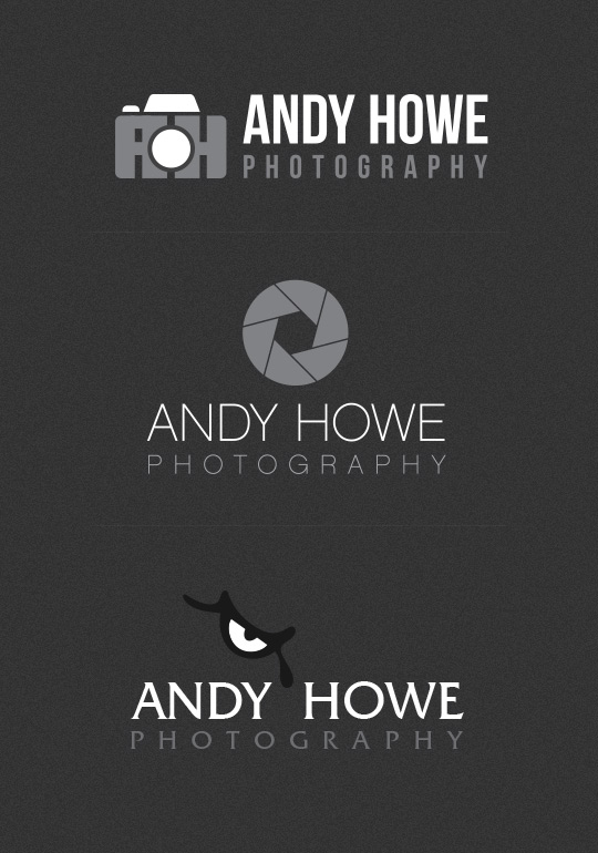
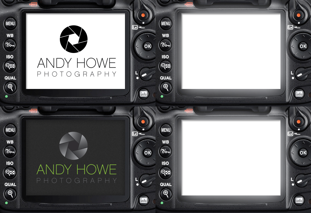
After dabbling with a few different concepts, we decided that less was more for this brand. By using a simple icon to represent the lens shutter of a camera, married with a lightweight modern font, we knew this would be perfect for his brand. Using a key colour of lime green was to represent and compliment the 'nature' side of the business. This logo was also designed in a manner that could be simplified as a 'watermark'.


